It was an honor to create a logo and promotional materials for a College classmate of mine, Jessica Morse. Jess is running for Congress in her district in California, and needed a logo to stand out and represent herself well in what will likely be a competitive race. She has a wealth of rich experiences, but has never run for public office before, so we decided to incorporate colors and a style that shows her strength, but also her uniqueness as a candidate. We chose blues and orange, for a bit of a change from the traditional red, white and blue that most candidates go with. Jess is an avid hiker, and has spent much time in the mountains and outdoor places that are a part of her district (including famous sites such as Yosemite and Lake Tahoe!)
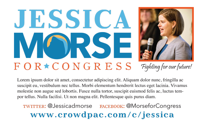
One of the features Jess definitely wanted to include was a nod to “Half Dome,” the epic rock formation in Yosemite. I designed a simplified graphic version of Half Dome and placed it inside the “O” of her last name, along with a yellow/orange sky to imply the dawn of a new era. I found a slightly colonial looking font for the “for Congress” portion, in a nod to the historical nature of Jess’s running, as well as her love of history. In addition, I designed business cards and promotional fliers for Jess to use in the early days of her campaign.
It was a pleasure working on this very important process with Jess, and I cannot wait to continue supporting her bid for public office. Rock on, Jess!


